Preparing the experience…
Case study
SaaS / Landing Page
AKS — AI SaaS Digital Experience
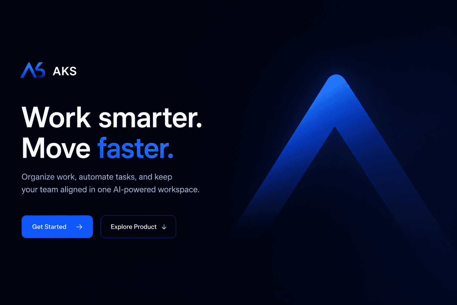
A modern SaaS experience built around a bold visual identity, structured storytelling, and purposeful motion — designed to present a complex AI product in a clear and engaging way.
01
Introduction
Introduction
AKS started as an exploration of how an AI SaaS product could build its own visual personality instead of looking like another generic tech landing page. The goal was to create an experience that feels modern, confident, and unmistakably connected to the product.
02
Problem
Problem
AI and SaaS websites often have a lot to communicate: features, workflows, product screens, pricing, and value. Presenting everything at once can quickly make the experience feel crowded and repetitive.
03
Approach
Approach
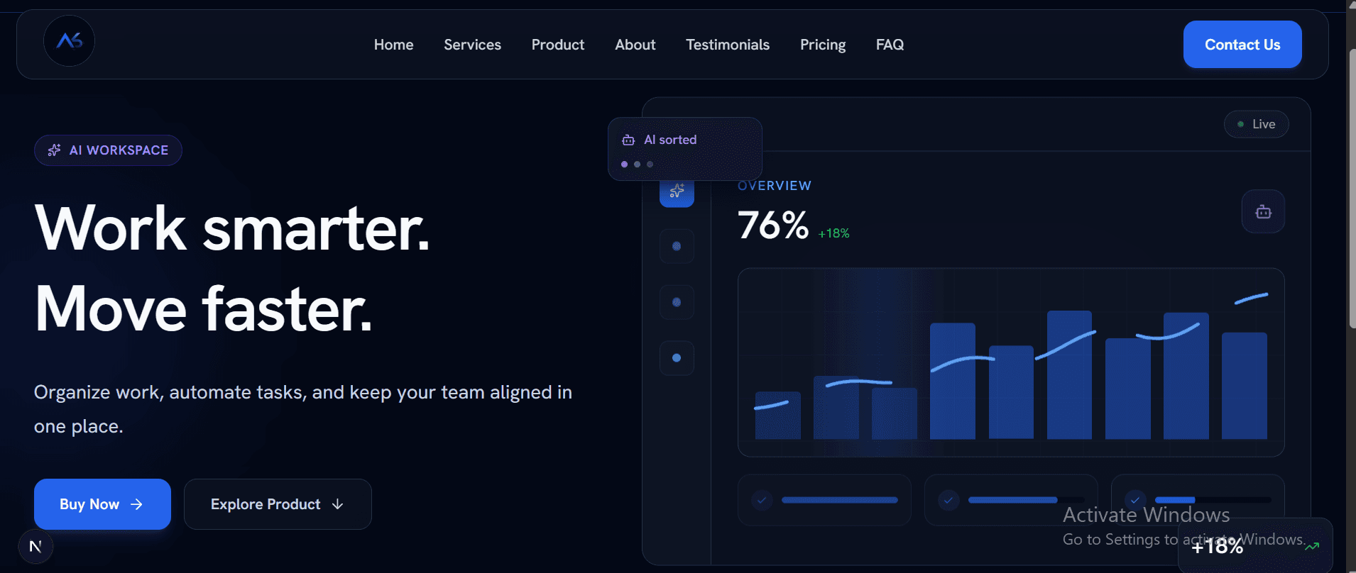
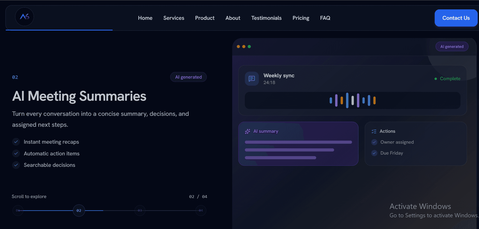
I built a clear visual system first, using a dark identity with blue and violet accents, strong typography, and consistent spacing. Then I structured the page as a journey from the core value proposition to services, product experience, brand story, pricing, and conversion — using motion to guide attention rather than decorate the interface.
04
Challenges
Challenges
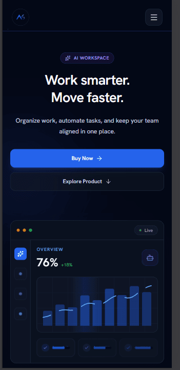
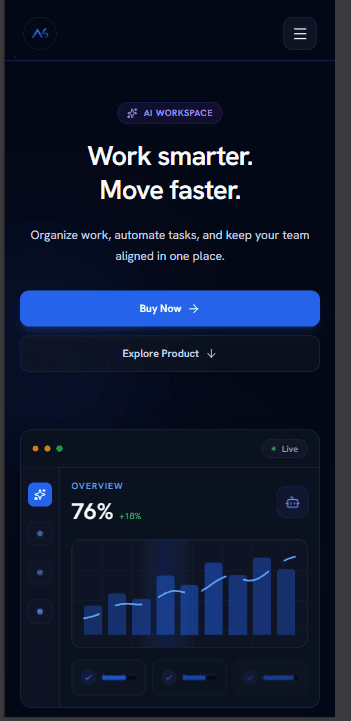
The main challenge was keeping a visually rich landing page fast and comfortable to explore. Multiple sections, product visuals, and animations had to work smoothly across devices without turning the experience into an overloaded showcase.
05
Result
Result
The result is a distinctive SaaS landing experience with a consistent identity, clear content hierarchy, responsive design, and smooth interactions that demonstrate how a technical product can still feel approachable and memorable.
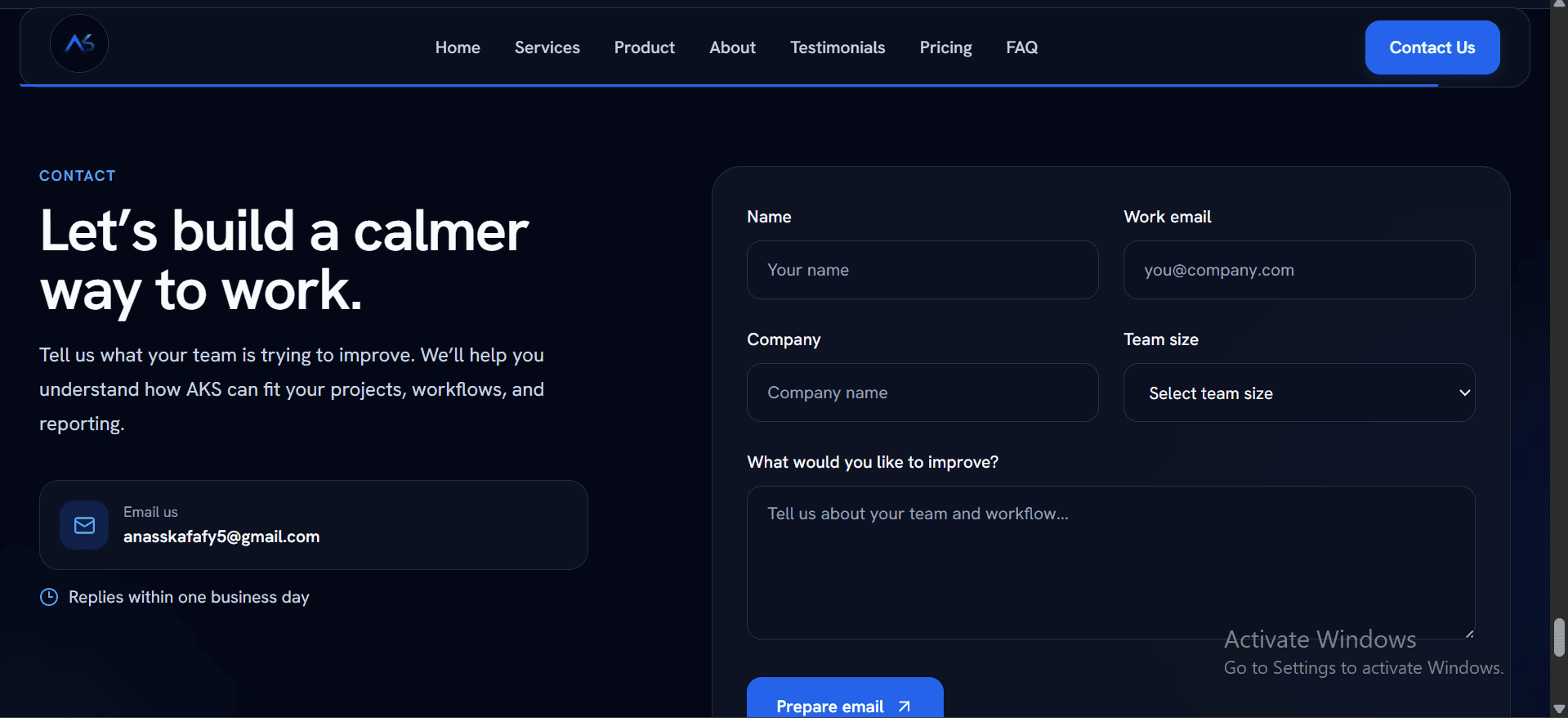
Have an idea that deserves this level of attention?